Showing posts with label colour theory. Show all posts

Thursday, 19 June 2014

The Pensive Palette: The Value of Art


The most important component of creating anything visual is value and value relationships.  Value is the how light or dark something appears and is based on a grey scale with black and white at the ends of the scale.  Although we describe them as colors, black, white, and the neutral greys in between are not technically colors, but values of light and dark.  Every color, however, has a value that is used to describe its lightness or darkness.  This is particularly helpful when trying to see the relative differences in values between multiple colors.

When designing a image, it is paramount to think in times of value before color.  Experience allows an artist to see value and color at the same time, but it is still helpful to work in black and white (and grey) in the early stages of design.  Color rarely saves a bad value design and usually only furthers the issue.  In fact, when an artist begins with a strong eye for value , almost any color scheme can be used as long as the colors chosen match the values in the design.

In my painting, “Magnificat”, you can see how I’ve used many colors to enhance the visual interest of the lion, but in black and white the values of those colors are similar enough to not distract from the overall design. 

Thursday, 15 May 2014

The Pensive Palette: Opposites Attract

The Pensive Palette: Opposites Attract


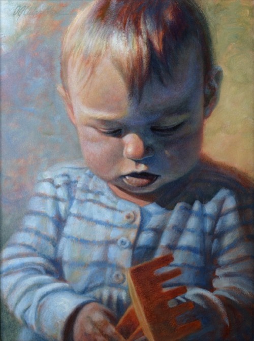
'Annika At One' | Aug 26, 2001 | 16”x12” Acrylic on board

When I decided to paint our eldest daughter on her first birthday, I chose to work in a fairly simple and classic portrait format.  I wanted the emphasis to be on her without a lot of distractions…
In order to keep the painting interesting and alive, I made color choices from a design point of view.  In this case, I employed complimentary or “opposite” colors.  These are the colors that are across from each other on the color wheel and are often used to enhance contrast. 

The main complementary pair I used was blue and orange, but there is also the yellow/purple pairing.  In order to make all of these colors work together, I chose blue to be my dominant color so the four colors wouldn’t compete.  I also made sure to desaturate most of the colors to keep them all fairly quiet.  Orange, the complement of my dominant blue, is the most saturated color.  This was done to help emphasize her hair and the shovel and create visual points of interest for the eye to go between.

I made the shadow side of her face a very subtle purple to give our eyes a break from the dominant blue.  In order to give this purple shadow a bit of color harmony, the background on the right side of the painting tends toward yellow.  Because I kept these colors quite desaturated, they do not look garish.  In fact, if you look closely you will see all of the colors of the rainbow in the painting, but desaturation keeps the color palette—and the final painting— in balance.