Showing posts with label wildlife. Show all posts

Saturday, 19 March 2016

The Pensive Palette: A Touch Of Spring


“Touch of Spring”, 18”x24”, acrylic on board

As we begin to thaw from the winter chill, we look forward to longer days and the return of our feathered friends from holiday. I like to imagine nature is a great theatrical stage and the critters are the players. Birds are my favorite “actors” and always add a spark of life to a wilderness experience.  Here’s a little touch of spring for your viewing pleasure!

Saturday, 23 January 2016

From Behind The Easel: Simile


“Simile," 21”x15,” acrylic on board

When I decided to paint a river otter, I wanted to capture the spirit of an animal that straddles both aquatic and terrestrial realms. As a mammal, the otter is most closely linked with other small land-based critters. But the otter is probably happiest in the water where it has evolved into a sleek, supple swimmer. I wanted to celebrate both sides of the otter.

The concept of the otter painting came from thinking of the otter’s complementary opposite worlds; land and water. With this is mind I decided to create a composition based on the Chinese yin and yang symbol. You can see the S shape divide between the water and rock, and the dark of the otter opposite the light, reflective water. The otter’s curved body and the bubbling water in the lower left help guide the eye around and back into the painting. I wanted the water itself to emulate the smooth, twisting nature of a swimming otter while the otter itself is at rest. This helps visually link the animal with its environment while maintaining an overall calm, almost zen-like feeling.

Thursday, 22 October 2015

From Behind The Easel: Miniature Show


“Early Spring," 9”x12,” acrylic on board 


“Liquid Gold," 12”x9,” acrylic on board

These two images are my own work, and will be included in the Miniature Show at Collector’s Covey Gallery. You can learn about the show here and see my past work for it here.

Monday, 28 September 2015

The Pensive Palette: Poised


“Poised”, 9”x12” acrylic on board

Sometimes, especially on small paintings, I depict my subject matter in a vignette style. This means that I create a fairly simple background without the environment that clearly allows the focus to be on the animal or bird. This doesn’t mean the background is not important. The colors and textures chosen need to compliment the subject and are hopefully interesting unto themselves. This a technique often employed by portrait artists to showcase the sitter. I like giving our furry and feathered friends this same treatment!

I was fortunate to have permission to use Frank Cleland’s wonderful photo of a Cassin’s Finch for my painting “Poised”. His photo lent itself to the vignette style because it was shot with a telephoto lens that blurred the background. I used specific colors to show off the bird, and subtle brushstrokes to help keep the background from feeling flat and lifeless. I also faded the branch into the background to remind the viewer that, while realistically portrayed, it is a painting and not a photo.

Saturday, 8 August 2015

From Behind The Easel: The Challenge


“The Challenge” (Detail), 24”x18” oil on canvas

Here’s a WIP of two red-winged blackbirds fighting for territory based on the wonderful photos of our dear friend, artist Ann Chaikin.


Please take a look at some of her work - her personal blog, her photography blog, her painting blog, her PBase, her Flickr, and her Facebook display her paintings and photography, and also serve as fountains of inspiration for any art-loving individual.

Monday, 2 March 2015

Inspiring Image: One Of My Dots


"Among The Teasels", Randal Dutra, 36" x 50", Oil on linen

I recently posted a quote by Steve Jobs where he advocated for connecting the dots of your life to help find your unique views.  Sometimes your dots can include the many dots of another person who is influential in your life.  I am fortunate to call artist Randal Dutra both mentor and friend.  Randal embodies the creative spirit and is fluent with any medium he feels will convey his vision.  Aside from his beautiful paintings and bronzes, Randal has amassed a 25 year career in film where he worked primarily in animation.  He is best known for his pioneering work on Jurassic Park and was nominated for an Academy Award for directing the animation on Steven Spielberg's War Of The Worlds.

Over the years, Randal has been generous with words of advice, critique, and inspiration.  I am the lucky recipient of his many years of experience across multiple genre and medium.  As we find our way along our journey, it important to remember that others walk before us and can be incredible resources.  When possible, look to those ahead of you for direction, inspiration, and how one can connect the dots.

See more of Randal's work at www.randaldutra.com

Tuesday, 27 January 2015

The Pensive Palette: Silhouettes


"Marsh Wren", 22"x14", oil on board

Visual clarity and simplicity are often forgotten by artists who are so excited about their subject matter that they include everything.  Good picture making begins with a solid idea expressed through strong composition.  To help me achieve my compositional goals and maintain a clear visual message, I will often use silhouettes to make sure the main elements read well.  Reducing shapes to basic silhouettes allows me to focus on shapes without the distraction of colour or detail.  I can also make sure the shape I'm working on is interesting and drawn well.

When testing with silhouettes I will usually work quite small (thumbnails under 2") so I'm not tempted to get fussy.  I want to make decisions based on readability and detail only makes this harder.  We all love detail and can easily fall in love with superficial aspects of a subject while forgetting the overall shape of what we're painting.  Another helpful tool is a digital camera or smartphone.  You can take a photo of a sketch or painting in the early stage.  Use a very small, black and white version of this photo to study the overall impact of the shapes and make sure what you want to say is being heard.

Saturday, 24 January 2015

Inspiring Image: Find Your Dots


"Trickster", Randal Dutra, 30"x40", oil on linen

"You can't connect the dots looking forward; you can only connect them looking backwards."- Steve Jobs


Steve Jobs, love him or hate him, made a large impact on the way most of us conduct our daily business. While the myth of Jobs is sometimes blown out of proportion, he did have a honed ability to connect seemingly disparate views and elements to create a new, unique perspective.  He is sometimes described as genius because his innovations seem so obvious upon introduction, yet no one had thought of it before him.  Genius can make the complex unknown understood in beautifully simple terms.  Genius helps us find something we didn't know we were looking for.

Jobs was a big advocate of being open to many sources and then trying to "connect the dots" in his own way.  He had the faith to believe his experience(s) were leading to something new.  We can all develop this ability but it requires awareness and reflection.  As Jobs says, hindsight is what helps connect our experiences into something useful.  The process, however, begins with an openness to that which we do not yet know, and the faith that our individual experience has worth.  

Here's to your unique journey!

Tuesday, 25 November 2014

The Pensive Palette: Your Eyes


“Beheld”, 9”x12” acrylic on board     

“All art is at once surface and symbol.” (Oscar Wilde)

Art offers itself as both decorative and meaningful. Sometimes the meaning is minimal or self-evident. At its best, art is layered and mysterious. It can be a powerful tool for us to see inside ourselves and learn about the world. Art is a personal endeavor because our interactions are based on what we bring to the process. Our experiences, knowledge, preferences, and hearts help us hear when art is speaking directly to us. It is the difference between “that’s pretty” and “I gotta have that!”. 

Monday, 20 October 2014

Inspiring Image: A Wild Life


“Resting Cat”, 22”x42”, acrylic on board, Bob Kuhn (1920-2007)

Bob Kuhn was a master of modern wildlife painting and a true original.  He began his career in art as an illustrator for magazine covers and calendars.  His early work feels a bit stiff in its execution, which was likely required by the graphic nature of the commercial world he worked within.  Once he moved into fine art painting full-time, his work began to take on a more organic quality with special attention paid to paint application and texture.  With his keen eye developed from years of drawing from life, Kuhn’s subjects are expertly rendered and often in wholly unique poses.

Kuhn is known for his deceivingly simple compositions with their signature horizontal formats and flat fields of color.  These large areas of color are often beautifully designed shapes with complex textures achieved by many layers paint applied with brush, palette knife, and finger.  Kuhn’s work is all the more impressive because he worked with acrylics, a medium that can be tricky to use in a painterly fashion.  His main subject matter was North American big game, although he beautifully captured African and Asian species as well.

Saturday, 18 October 2014

From Behind the Easel: Colour Me Glad


“Autumn’s Embrace”, 24”x18”” acrylic on canvas

Autumn is here and my heart leaps.  The shortened days and crisper temperatures remind us that the year is quickly sliding into the darker half.  We collect our bounty as we brace against the barren time ahead.  Our thoughts turn inward while personal journeys of recollection take hold.  But before we shutter ourselves away for the winter, we are treated to nature’s triumph of color.  The artist in autumn is offered the most freedom to explore a vivid palette while remaining true to the source.


My painting “Autumn’s Embrace” features a pair of cedar waxwings against the turning leaves of an aspen.  I love to walk among stands of aspen as they filter the light and gently quake in the breeze.  Their turning leaves have almost a pointillist quality and I decided to frame the tree in my painting quite closely so it has a slightly abstract feel to it.

Monday, 28 July 2014

From Behind the Easel: Music To My Eyes


"Interlude", 16"x28", acrylic on board

Aside from nature, music is my biggest inspiration.  I am pretty sure I was a bass player in a previous life, and often dream of life as a musician.  In some ways, music is more important to me than art for the simple fact that music is always on in our home.  Even when art has to take a back seat to daily life, music is a constant.  Music lifts my spirit and helps me reach inside for creative energy. 

Although I can only imagine what it must feel like to create musical magic, I can use music and musical ideas for my own purposes.  My painting “Interlude” features a cougar drinking at a pool under moonlight.  An interlude in music is a short piece inserted between the longer parts of a composition.  It is a small rest from the larger themes and allows us to reflect upon what we are experiencing.  I have shown the cougar taking a short break from his nighttime activities.  We, in turn, are allowed to pause for a moment as we enjoy this intimate scene.

Friday, 11 July 2014

The Pensive Palette: You Light Up My Life


“Water Dance”, 12”x16”, oil on board


Most realist painting includes an element of what we see.  The majority of people think we see stuff.  The reality is we see light reflecting off of stuff.  How we see the stuff depends on the quality, intensity, and color of the light source that allows us to see the object.  As a painter, it is important to remember we are capturing the effects of light on objects.  Developing a keen eye and ability to really see light is paramount.  We need to be able to distinguish subtle changes and shifts in light quality.  The more we understand the world around us, the more we can dissect and reconstruct it in our art.

My painting “Water Dance” is all about the gorgeous, fleeting time of day before sunset known as the magic hour.  The sun’s light is nearing the horizon and traveling at a more severe angle, needing to pass through more air molecules.  Short blue and violet light waves are scattered by the atmosphere and longer orange-red light waves pass through unaffected.  This produces the warm glow we see on objects near sunset.  

The observant artist can study all the light around them and make use of quality, direction, and color of light to convey time of day as well as mood and emotion.

Wednesday, 9 July 2014

Inspiring Image: Duck Dynasty


“Goldeneye”, 7”x10” acrylic on board (2013), Robert Steiner
  
When I began my professional art career I worked within the confines of the established world of wildlife art.  I love portraying the beauty of the natural world and the amazing creatures that inhabit it.  My introduction into this genre came from exposure to duck stamp art that was popular where I grew up.  Paintings were chosen each year to be turned into stamps purchased by duck hunters as proof of registration.  The proceeds in turn helped purchase and protect wetland habitat.  I am proud that a number of my paintings have been used for land conservation over the years.

My biggest inspiration in the duck stamp world is Robert Steiner.  I first met Bob at an art show in Michigan and he was very encouraging to the dreams of a then 13 year-old aspiring artist.  We met again years later at another art show as fellow exhibitors and have remained friends since.  Over the years he has continued to push the boundaries of realist painting and redefine duck stamp art.  He is the most decorated artist in stamp art history with 82 winning designs including two federal wins.  To see more of Bob’s work please visit www.steinerprints.com.

Saturday, 5 July 2014

From Behind the Easel: Restful Rising


Restful Rising,   9”x12”, oil on board

We have safely returned from our family vacation to witness my youngest brother happily wedded.  After a wonderful week of travel and celebration it is now time to get back to our routines...  

To honor the beginning of my brother’s marriage and my return to blogging, I offer a small token of a painting.  “Restful Rising” depicts a pair of American Avocets greeting the sun as it crests the horizon to begin the new day.  Every event we encounter in our lives, monumental or miniscule, is an opportunity to renew our celebration of life.  

Saturday, 21 June 2014

From Behind the Easel: Pacific Rhythm


 Pacific Rhythm | 18”x36” | acrylic on board

This coming week we will be in the San Francisco Bay Area to help celebrate my youngest brother’s wedding.  As we return to our home of seven years, I am reminded of many wonderful times.  We loved to hike along the coast where the primordial elements come together in sometimes harsh, but always fascinating and beautiful ways.  Storms rolling in across the ocean inspire both awe and respect for the power you can literally feel as waves crash against the shore.

My painting “Pacific Rhythm” is from reference gathered near Halfmoon Bay just south of San Francisco along Highway 1.  Our planned hike originally had us continuing along this stretch of beach for a while, but as the storm rolled in and the tide rose quickly, we didn’t go beyond the rocky point seen here in the painting.  We were warned by some local folks that we would likely get stranded until the tide receded after midnight if we did.  Worse yet, we could easily get swept out to sea by the rising swells and crashing waves.  We opted for a hot chocolate at a cozy cafĂ© instead, and I lived to paint the picture you see here.

Thursday, 19 June 2014

The Pensive Palette: The Value of Art


The most important component of creating anything visual is value and value relationships.  Value is the how light or dark something appears and is based on a grey scale with black and white at the ends of the scale.  Although we describe them as colors, black, white, and the neutral greys in between are not technically colors, but values of light and dark.  Every color, however, has a value that is used to describe its lightness or darkness.  This is particularly helpful when trying to see the relative differences in values between multiple colors.

When designing a image, it is paramount to think in times of value before color.  Experience allows an artist to see value and color at the same time, but it is still helpful to work in black and white (and grey) in the early stages of design.  Color rarely saves a bad value design and usually only furthers the issue.  In fact, when an artist begins with a strong eye for value , almost any color scheme can be used as long as the colors chosen match the values in the design.

In my painting, “Magnificat”, you can see how I’ve used many colors to enhance the visual interest of the lion, but in black and white the values of those colors are similar enough to not distract from the overall design. 

Saturday, 24 May 2014

From Behind the Easel: Gentle Reflection


‘Gentle Reflection | Canada Geese | 24”x36” oil (available on Etsy!)
I’m drawn to the alluring sounds of water and the cooling presence along a favorite hike. Discovering a hidden pool deep in the woods is a magical experience, and studying the interplay of reflections in water was my earliest form of meditation.
In “Gentle Reflection”, I explored the intricate patterns created on the calm pond’s surface. The harmonious quality is enhanced by the calligraphic nature of the intertwining winter reeds along the marsh border.

Sunday, 11 May 2014

From Behind The Easel: The Subject for Subject's Sake

From Behind The Easel: The Subject for Subject's Sake


Tiger Study | 9" x 12" | oil on canvas 

Sometimes subject matter is so inspiring that it needs little else— in this case, I was moved to simply paint a tiger portrait without an environment, without strong action, without needing to show him doing more than being his magnificent self.

This vignette is oil on canvas— I chose background colours to imply a natural setting through rhythm and variation as well as to complement the tiger’s brilliant coat.

We met this tiger personally at a reserve in California… his magnetic presence and the stunning impression of being a few feet away from this powerful cat gave me such a profound sense of respect that I felt moved to paint him. 

Monday, 5 May 2014

The Pensive Palette: On Negative Space

The Pensive Palette: On Negative Space


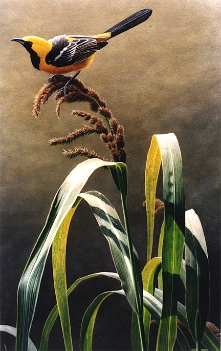
‘Alight’ | 24” x 14” | acrylic on board (sold)

“The design of negative space can be just as important as the positive image.” (Joan Fedoroshyn)

As an artist, it is easy to be seduced by the primary subject matter we choose to represent.  But when you think of a painting as a flat space to be filled with interesting shapes, then design places just as much importance on the elements that aren’t immediately obvious. 

In music, pauses in a song add interest and build tension-- in the same way, spaces between objects in a painting become necessary and integral elements that require just as much thought as the objects themselves.

In this painting, ‘Alight’, featuring an oriole perched on marsh grass, I was conscious of the repeating arches of the grass bending under the bird’s weight.  The spaces between the blades created an interesting rhythm of pleasing shapes that allow the eye to dance with the positive and negative despite the relative simplicity of the background. I made an effort, in this case, to vary the shapes and keep them both feeling natural and asymmetrical while still giving a sense of balance and movement to the composition.