Showing posts with label bird. Show all posts

Saturday, 19 March 2016

The Pensive Palette: A Touch Of Spring


“Touch of Spring”, 18”x24”, acrylic on board

As we begin to thaw from the winter chill, we look forward to longer days and the return of our feathered friends from holiday. I like to imagine nature is a great theatrical stage and the critters are the players. Birds are my favorite “actors” and always add a spark of life to a wilderness experience.  Here’s a little touch of spring for your viewing pleasure!

Thursday, 22 October 2015

From Behind The Easel: Miniature Show


“Early Spring," 9”x12,” acrylic on board 


“Liquid Gold," 12”x9,” acrylic on board

These two images are my own work, and will be included in the Miniature Show at Collector’s Covey Gallery. You can learn about the show here and see my past work for it here.

Monday, 28 September 2015

The Pensive Palette: Poised


“Poised”, 9”x12” acrylic on board

Sometimes, especially on small paintings, I depict my subject matter in a vignette style. This means that I create a fairly simple background without the environment that clearly allows the focus to be on the animal or bird. This doesn’t mean the background is not important. The colors and textures chosen need to compliment the subject and are hopefully interesting unto themselves. This a technique often employed by portrait artists to showcase the sitter. I like giving our furry and feathered friends this same treatment!

I was fortunate to have permission to use Frank Cleland’s wonderful photo of a Cassin’s Finch for my painting “Poised”. His photo lent itself to the vignette style because it was shot with a telephoto lens that blurred the background. I used specific colors to show off the bird, and subtle brushstrokes to help keep the background from feeling flat and lifeless. I also faded the branch into the background to remind the viewer that, while realistically portrayed, it is a painting and not a photo.

Saturday, 8 August 2015

From Behind The Easel: The Challenge


“The Challenge” (Detail), 24”x18” oil on canvas

Here’s a WIP of two red-winged blackbirds fighting for territory based on the wonderful photos of our dear friend, artist Ann Chaikin.


Please take a look at some of her work - her personal blog, her photography blog, her painting blog, her PBase, her Flickr, and her Facebook display her paintings and photography, and also serve as fountains of inspiration for any art-loving individual.

Tuesday, 27 January 2015

The Pensive Palette: Silhouettes


"Marsh Wren", 22"x14", oil on board

Visual clarity and simplicity are often forgotten by artists who are so excited about their subject matter that they include everything.  Good picture making begins with a solid idea expressed through strong composition.  To help me achieve my compositional goals and maintain a clear visual message, I will often use silhouettes to make sure the main elements read well.  Reducing shapes to basic silhouettes allows me to focus on shapes without the distraction of colour or detail.  I can also make sure the shape I'm working on is interesting and drawn well.

When testing with silhouettes I will usually work quite small (thumbnails under 2") so I'm not tempted to get fussy.  I want to make decisions based on readability and detail only makes this harder.  We all love detail and can easily fall in love with superficial aspects of a subject while forgetting the overall shape of what we're painting.  Another helpful tool is a digital camera or smartphone.  You can take a photo of a sketch or painting in the early stage.  Use a very small, black and white version of this photo to study the overall impact of the shapes and make sure what you want to say is being heard.

Tuesday, 25 November 2014

The Pensive Palette: Your Eyes


“Beheld”, 9”x12” acrylic on board     

“All art is at once surface and symbol.” (Oscar Wilde)

Art offers itself as both decorative and meaningful. Sometimes the meaning is minimal or self-evident. At its best, art is layered and mysterious. It can be a powerful tool for us to see inside ourselves and learn about the world. Art is a personal endeavor because our interactions are based on what we bring to the process. Our experiences, knowledge, preferences, and hearts help us hear when art is speaking directly to us. It is the difference between “that’s pretty” and “I gotta have that!”. 

Saturday, 18 October 2014

From Behind the Easel: Colour Me Glad


“Autumn’s Embrace”, 24”x18”” acrylic on canvas

Autumn is here and my heart leaps.  The shortened days and crisper temperatures remind us that the year is quickly sliding into the darker half.  We collect our bounty as we brace against the barren time ahead.  Our thoughts turn inward while personal journeys of recollection take hold.  But before we shutter ourselves away for the winter, we are treated to nature’s triumph of color.  The artist in autumn is offered the most freedom to explore a vivid palette while remaining true to the source.


My painting “Autumn’s Embrace” features a pair of cedar waxwings against the turning leaves of an aspen.  I love to walk among stands of aspen as they filter the light and gently quake in the breeze.  Their turning leaves have almost a pointillist quality and I decided to frame the tree in my painting quite closely so it has a slightly abstract feel to it.

Friday, 11 July 2014

The Pensive Palette: You Light Up My Life


“Water Dance”, 12”x16”, oil on board


Most realist painting includes an element of what we see.  The majority of people think we see stuff.  The reality is we see light reflecting off of stuff.  How we see the stuff depends on the quality, intensity, and color of the light source that allows us to see the object.  As a painter, it is important to remember we are capturing the effects of light on objects.  Developing a keen eye and ability to really see light is paramount.  We need to be able to distinguish subtle changes and shifts in light quality.  The more we understand the world around us, the more we can dissect and reconstruct it in our art.

My painting “Water Dance” is all about the gorgeous, fleeting time of day before sunset known as the magic hour.  The sun’s light is nearing the horizon and traveling at a more severe angle, needing to pass through more air molecules.  Short blue and violet light waves are scattered by the atmosphere and longer orange-red light waves pass through unaffected.  This produces the warm glow we see on objects near sunset.  

The observant artist can study all the light around them and make use of quality, direction, and color of light to convey time of day as well as mood and emotion.

Saturday, 5 July 2014

From Behind the Easel: Restful Rising


Restful Rising,   9”x12”, oil on board

We have safely returned from our family vacation to witness my youngest brother happily wedded.  After a wonderful week of travel and celebration it is now time to get back to our routines...  

To honor the beginning of my brother’s marriage and my return to blogging, I offer a small token of a painting.  “Restful Rising” depicts a pair of American Avocets greeting the sun as it crests the horizon to begin the new day.  Every event we encounter in our lives, monumental or miniscule, is an opportunity to renew our celebration of life.  

Saturday, 21 June 2014

From Behind the Easel: Pacific Rhythm


 Pacific Rhythm | 18”x36” | acrylic on board

This coming week we will be in the San Francisco Bay Area to help celebrate my youngest brother’s wedding.  As we return to our home of seven years, I am reminded of many wonderful times.  We loved to hike along the coast where the primordial elements come together in sometimes harsh, but always fascinating and beautiful ways.  Storms rolling in across the ocean inspire both awe and respect for the power you can literally feel as waves crash against the shore.

My painting “Pacific Rhythm” is from reference gathered near Halfmoon Bay just south of San Francisco along Highway 1.  Our planned hike originally had us continuing along this stretch of beach for a while, but as the storm rolled in and the tide rose quickly, we didn’t go beyond the rocky point seen here in the painting.  We were warned by some local folks that we would likely get stranded until the tide receded after midnight if we did.  Worse yet, we could easily get swept out to sea by the rising swells and crashing waves.  We opted for a hot chocolate at a cozy cafĂ© instead, and I lived to paint the picture you see here.

Saturday, 24 May 2014

From Behind the Easel: Gentle Reflection


‘Gentle Reflection | Canada Geese | 24”x36” oil (available on Etsy!)
I’m drawn to the alluring sounds of water and the cooling presence along a favorite hike. Discovering a hidden pool deep in the woods is a magical experience, and studying the interplay of reflections in water was my earliest form of meditation.
In “Gentle Reflection”, I explored the intricate patterns created on the calm pond’s surface. The harmonious quality is enhanced by the calligraphic nature of the intertwining winter reeds along the marsh border.

Friday, 9 May 2014

From Behind the Easel: What's in a Name?

From Behind the Easel: What's in a Name?


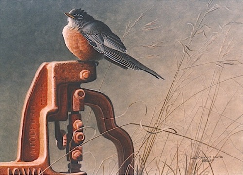
 "Pumped" | American Robin | 12”x16” | acrylic on board (sold)

There are many ways we can be inspired.  Our senses feed our spirit and our intuition and experience lead us down the path.  When it comes to concepts for paintings, I will work with any method that keeps me excited which, in turn, yields my best work.  And sometimes, that method can feel like I’m working backwards.  Usually, I will title my paintings as they are nearing completion or after I’ve lived with them for a little while.  But in the case of “Pumped”, the name inspired the concept.

While looking through reference to start a new painting for a show some time ago, my eye caught an image of an old well.  Trying to think of how I could use the reference, I kept coming back to the interesting pump… I realized that I needed to listen to what the pump is saying to me.

I’m usually not a fan of silly or punny titles, but in this case the pump led to the idea of being “pumped”.  I thought a nice little bird all pumped up would look great sitting on the pump.  The orange patina of the painted handle led me to look for a bird that would work well in that color scheme.  Quite happily, I found some reference of a puffed up robin with his brilliant red breast on display that complemented the design.  And when the painting “Pumped” was finished and well received, I was pretty pumped too!

Monday, 5 May 2014

The Pensive Palette: On Negative Space

The Pensive Palette: On Negative Space


‘Alight’ | 24” x 14” | acrylic on board (sold)

“The design of negative space can be just as important as the positive image.” (Joan Fedoroshyn)

As an artist, it is easy to be seduced by the primary subject matter we choose to represent.  But when you think of a painting as a flat space to be filled with interesting shapes, then design places just as much importance on the elements that aren’t immediately obvious. 

In music, pauses in a song add interest and build tension-- in the same way, spaces between objects in a painting become necessary and integral elements that require just as much thought as the objects themselves.

In this painting, ‘Alight’, featuring an oriole perched on marsh grass, I was conscious of the repeating arches of the grass bending under the bird’s weight.  The spaces between the blades created an interesting rhythm of pleasing shapes that allow the eye to dance with the positive and negative despite the relative simplicity of the background. I made an effort, in this case, to vary the shapes and keep them both feeling natural and asymmetrical while still giving a sense of balance and movement to the composition.

Sunday, 4 May 2014

From Behind the Easel: Animals with Attitude

From Behind the Easel: Animals with Attitude


‘Rough-Legged Hawk’ | 16”x12” | acrylic on board

When I feel compelled to paint an animal, it is usually because of their innate beauty or unique pose that enhances a composition.  Sometimes I am simply drawn to an animal’s attitude or personality.  This is certainly the case with this rough-legged hawk.  While he is a beautiful specimen in his own right, what I love is the regal way in which he carries himself with human-like poise.  He looks good and I think he knows it!

Anyone with pets or who has spent a lot of time around animals knows they have very distinct personalities.  We also know that animals are  capable of complex emotions and feelings.  Sometimes when I am photographing animals, I will quietly ask certain “models” if they would like to be featured in a painting.  Believe it or not, this usually leads to them holding a specific angle I am hoping to capture.  Coincidence, maybe, but I like to believe animals are operating on a higher level than we imagine! 

Thursday, 1 May 2014

From Behind the Easel: Sentinel

From Behind the Easel:
'Sentinel' | Western Gull | 12 x 9 | acrylic on board (available)

The reference for this fence is an old split-rail fence from Pt. Reyes (Northern California) that we saw at sunset one day while hiking.  

The vertical cropping reminded me of a Chinese character, which created a quiet, peaceful mood for me.  But the solidity of the fence also provided strength and grounding, making me think about a soldier walking on a parapet, standing guard.

So this idea emerged, of a gull standing quietly, keeping watch over his domain.