Tuesday 25 November 2014

The Pensive Palette: Your Eyes


“Beheld”, 9”x12” acrylic on board     

“All art is at once surface and symbol.” (Oscar Wilde)

Art offers itself as both decorative and meaningful. Sometimes the meaning is minimal or self-evident. At its best, art is layered and mysterious. It can be a powerful tool for us to see inside ourselves and learn about the world. Art is a personal endeavor because our interactions are based on what we bring to the process. Our experiences, knowledge, preferences, and hearts help us hear when art is speaking directly to us. It is the difference between “that’s pretty” and “I gotta have that!”. 

Inspiring Image: South African Police Station


 South African Police Station, 12" x 17", oil; 1891 Sir Frank Brangwyn (1867-1956)

I quite like this quiet, understated painting of a South African police station from 1891 by Sir Frank Brangwyn. The field in particular is handled beautifully without being overly detailed.


Tuesday 11 November 2014

From Behind the Easel: Descending Shadows


“Descending Shadows”, 24”x18”” oil on board

As some of you may know, our family has recently decided to make some shifts in our perspective and attempt to follow our own path.  What that means is we sold our house, took the kids out of school, and started accepting what the world was offering us.  Our plan is loosely structured and we make our decisions together.  The kids are all homeschooling (or as I like to say “lifeschooling”) and we are finding truly wonderful learning experiences outside of the traditional model.  This is something we have contemplated for many years and have finally had the courage to attempt.  We feel blessed to be in a position to take hold of this opportunity.

Our most recent excursion was moving ourselves eastward for nearly three weeks to house/kitty-sit for dear friends who were away in Europe.  We had the fabulous chance to experience living in the Okanagan valley, affectionately known as Napa North for the many world-class wineries.  The valley is the northern tip of the Sonora Desert and is a richly bio-diverse environment.  We were treated to amazing views of clouds rolling into the valley below while mule deer and bighorn sheep grazed the property.  Needless to say the inspiration for painting was prevalent and I look forward to what will come from our stay there.

Here is a painting I did based on previous trips to the area.  You can see the beautiful rock outcrop as a backdrop to the understated beauty of the sagebrush, all backlit by the beautiful Okanagan light.  You can see another painting I did from the area in my post from May 17, 2014.

Monday 20 October 2014

Inspiring Image: A Wild Life


“Resting Cat”, 22”x42”, acrylic on board, Bob Kuhn (1920-2007)

Bob Kuhn was a master of modern wildlife painting and a true original.  He began his career in art as an illustrator for magazine covers and calendars.  His early work feels a bit stiff in its execution, which was likely required by the graphic nature of the commercial world he worked within.  Once he moved into fine art painting full-time, his work began to take on a more organic quality with special attention paid to paint application and texture.  With his keen eye developed from years of drawing from life, Kuhn’s subjects are expertly rendered and often in wholly unique poses.

Kuhn is known for his deceivingly simple compositions with their signature horizontal formats and flat fields of color.  These large areas of color are often beautifully designed shapes with complex textures achieved by many layers paint applied with brush, palette knife, and finger.  Kuhn’s work is all the more impressive because he worked with acrylics, a medium that can be tricky to use in a painterly fashion.  His main subject matter was North American big game, although he beautifully captured African and Asian species as well.

Saturday 18 October 2014

From Behind the Easel: Colour Me Glad


“Autumn’s Embrace”, 24”x18”” acrylic on canvas

Autumn is here and my heart leaps.  The shortened days and crisper temperatures remind us that the year is quickly sliding into the darker half.  We collect our bounty as we brace against the barren time ahead.  Our thoughts turn inward while personal journeys of recollection take hold.  But before we shutter ourselves away for the winter, we are treated to nature’s triumph of color.  The artist in autumn is offered the most freedom to explore a vivid palette while remaining true to the source.


My painting “Autumn’s Embrace” features a pair of cedar waxwings against the turning leaves of an aspen.  I love to walk among stands of aspen as they filter the light and gently quake in the breeze.  Their turning leaves have almost a pointillist quality and I decided to frame the tree in my painting quite closely so it has a slightly abstract feel to it.

Monday 28 July 2014

From Behind the Easel: Music To My Eyes


"Interlude", 16"x28", acrylic on board

Aside from nature, music is my biggest inspiration.  I am pretty sure I was a bass player in a previous life, and often dream of life as a musician.  In some ways, music is more important to me than art for the simple fact that music is always on in our home.  Even when art has to take a back seat to daily life, music is a constant.  Music lifts my spirit and helps me reach inside for creative energy. 

Although I can only imagine what it must feel like to create musical magic, I can use music and musical ideas for my own purposes.  My painting “Interlude” features a cougar drinking at a pool under moonlight.  An interlude in music is a short piece inserted between the longer parts of a composition.  It is a small rest from the larger themes and allows us to reflect upon what we are experiencing.  I have shown the cougar taking a short break from his nighttime activities.  We, in turn, are allowed to pause for a moment as we enjoy this intimate scene.

Friday 11 July 2014

The Pensive Palette: You Light Up My Life


“Water Dance”, 12”x16”, oil on board


Most realist painting includes an element of what we see.  The majority of people think we see stuff.  The reality is we see light reflecting off of stuff.  How we see the stuff depends on the quality, intensity, and color of the light source that allows us to see the object.  As a painter, it is important to remember we are capturing the effects of light on objects.  Developing a keen eye and ability to really see light is paramount.  We need to be able to distinguish subtle changes and shifts in light quality.  The more we understand the world around us, the more we can dissect and reconstruct it in our art.

My painting “Water Dance” is all about the gorgeous, fleeting time of day before sunset known as the magic hour.  The sun’s light is nearing the horizon and traveling at a more severe angle, needing to pass through more air molecules.  Short blue and violet light waves are scattered by the atmosphere and longer orange-red light waves pass through unaffected.  This produces the warm glow we see on objects near sunset.  

The observant artist can study all the light around them and make use of quality, direction, and color of light to convey time of day as well as mood and emotion.

Wednesday 9 July 2014

Inspiring Image: Duck Dynasty


“Goldeneye”, 7”x10” acrylic on board (2013), Robert Steiner
  
When I began my professional art career I worked within the confines of the established world of wildlife art.  I love portraying the beauty of the natural world and the amazing creatures that inhabit it.  My introduction into this genre came from exposure to duck stamp art that was popular where I grew up.  Paintings were chosen each year to be turned into stamps purchased by duck hunters as proof of registration.  The proceeds in turn helped purchase and protect wetland habitat.  I am proud that a number of my paintings have been used for land conservation over the years.

My biggest inspiration in the duck stamp world is Robert Steiner.  I first met Bob at an art show in Michigan and he was very encouraging to the dreams of a then 13 year-old aspiring artist.  We met again years later at another art show as fellow exhibitors and have remained friends since.  Over the years he has continued to push the boundaries of realist painting and redefine duck stamp art.  He is the most decorated artist in stamp art history with 82 winning designs including two federal wins.  To see more of Bob’s work please visit www.steinerprints.com.

Saturday 5 July 2014

From Behind the Easel: Restful Rising


Restful Rising,   9”x12”, oil on board

We have safely returned from our family vacation to witness my youngest brother happily wedded.  After a wonderful week of travel and celebration it is now time to get back to our routines...  

To honor the beginning of my brother’s marriage and my return to blogging, I offer a small token of a painting.  “Restful Rising” depicts a pair of American Avocets greeting the sun as it crests the horizon to begin the new day.  Every event we encounter in our lives, monumental or miniscule, is an opportunity to renew our celebration of life.  

Tuesday 24 June 2014

Inspiring Image: Elevating History to Mythology


“Bocklin’s Tomb” (1901) by Ferdinand Keller (1842-1922)


Ferdinand Keller was a German painter classically trained in landscape and portraiture with an interest in historical subject matter.  In his later years, he was heavily influenced by the Swiss Symbolist painter Arnold Bocklin. Keller was drawn to Bocklin’s love of the Romantic era and his portrayal of fantastical worlds.  After seeing the work of Bocklin, Keller made the shift from historical themes to those of mythology and magic.

Upon Bocklin’s death in 1901, Keller honored his memory with the beautiful painting “Bocklin’s Tomb”.  Here he references Bocklin’s own painting “The Isle of the Dead”, and creates his vision of how Bocklin might wish to be visually eulogized.  The painting wonderfully combines a sense of the real with a feeling of fantasy, and somehow we know this place only exists on canvas even though it looks real.  In doing so, Keller has fittingly elevated Bocklin from art history to mythology.

Saturday 21 June 2014

From Behind the Easel: Pacific Rhythm


 Pacific Rhythm | 18”x36” | acrylic on board

This coming week we will be in the San Francisco Bay Area to help celebrate my youngest brother’s wedding.  As we return to our home of seven years, I am reminded of many wonderful times.  We loved to hike along the coast where the primordial elements come together in sometimes harsh, but always fascinating and beautiful ways.  Storms rolling in across the ocean inspire both awe and respect for the power you can literally feel as waves crash against the shore.

My painting “Pacific Rhythm” is from reference gathered near Halfmoon Bay just south of San Francisco along Highway 1.  Our planned hike originally had us continuing along this stretch of beach for a while, but as the storm rolled in and the tide rose quickly, we didn’t go beyond the rocky point seen here in the painting.  We were warned by some local folks that we would likely get stranded until the tide receded after midnight if we did.  Worse yet, we could easily get swept out to sea by the rising swells and crashing waves.  We opted for a hot chocolate at a cozy café instead, and I lived to paint the picture you see here.

Thursday 19 June 2014

The Pensive Palette: The Value of Art


The most important component of creating anything visual is value and value relationships.  Value is the how light or dark something appears and is based on a grey scale with black and white at the ends of the scale.  Although we describe them as colors, black, white, and the neutral greys in between are not technically colors, but values of light and dark.  Every color, however, has a value that is used to describe its lightness or darkness.  This is particularly helpful when trying to see the relative differences in values between multiple colors.

When designing a image, it is paramount to think in times of value before color.  Experience allows an artist to see value and color at the same time, but it is still helpful to work in black and white (and grey) in the early stages of design.  Color rarely saves a bad value design and usually only furthers the issue.  In fact, when an artist begins with a strong eye for value , almost any color scheme can be used as long as the colors chosen match the values in the design.

In my painting, “Magnificat”, you can see how I’ve used many colors to enhance the visual interest of the lion, but in black and white the values of those colors are similar enough to not distract from the overall design. 

Tuesday 17 June 2014

Inspiring Image: Story in Art


"The Blind Beggar" | Jules Bastien-Lepage (1848-1884)

I love an image that can tell an entire story.  The greatest paintings give enough visually to allow us go into our imaginations without providing everything.  We are free to interpret and create our own version of what we see.  Great art offers itself wholly yet remains mysterious, open to reinterpretation as we grow with it.  Great art offers a window into our own hearts.

What story do you see when you look upon this boy and his faithful companion? 

Thursday 12 June 2014

The Pensive Palette: I Am Robert Genn


As an artist, I feel a part of a greater community, a brother and sisterhood of creative people searching for beauty, truth, and meaning.  While I work by myself, I know I’m not alone in these pursuits.  When I see art that touches me, or a song that moves me, I feel connected to that artist because we have shared a part of the journey together.  I take a little part of that person’s spirit and place it within me, hoping to pass it along to someone else.  This is the greatest gift of art.

I recently wrote about the passing of artist Robert Genn.  His love of painting, and especially his exploration of the why’s and how’s of making art, live on in everything he touched.  A little piece of his spirit is carried by all of us.   

Here is a small study I did a few years ago in Genn’s style.  It is not a copy of one of his paintings, but an exercise in taking my own reference and trying to think like he did.  In making choices that are different from my own tendencies, I learn how to see outside of myself. 

Saturday 7 June 2014

From Behind The Easel: 'Another Time'


"Another Time" | Medieval Town North of Paris | 12" x 8" | oil on board


We had the good fortune to be invited to a lovely wedding in a chalet about an hour north of Paris.  On the way back, we meandered through this lovely town and I felt I wanted to capture the intimacy and charm.

Tuesday 3 June 2014

Inspiring Image: Celebrating Artist Robert Genn


by Robert Genn (1936-2014)

On Tuesday May 27th, the art world lost a friend and inspiration.  Robert Genn was a Canadian painter best known for capturing the landscape of his homeland and many travels around the world.
His personal style was heavily influenced by the Group of Seven painters, as well as the iconic Emily Carr, whom he met when he was a boy growing up in Victoria, BC.  His career began in illustration but evolved into full time fine art pursuits when his passion could no longer be held in check.  He went on to enjoy a long and commercially successful career garnering international acclaim.
Despite his successes, Genn never lost sight of his love of painting.  The physical act and ritual of starting from a blank canvas fuelled his desire.  His passion for travel and painting outdoors only grew over time, and his art is beloved by many.
Perhaps his greatest gift was the free website he started many years ago to act as a meeting place for artists.  He brought like-minded people together, gathered art/inspirational quotes from around the world, and provided a semi-weekly newsletter about his ideas for making and selling art.
Robert Genn was an inspirational pillar in our artist community.  His generous spirit will be missed and never forgotten.  His legacy lives on as his daughter Sara Genn, a highly successful artist herself, continues the tradition of the weekly newsletter.
To see more of Robert Genn's work and check out his free resource website for creative minds, please go to www.robertgenn.com and click on the Painters Keys Community.

Thursday 29 May 2014

The Pensive Palette: The Value of Mirror Image


‘Stillness’ (Study) | 16”x20” | oil on canvas

We all have a natural bias when creating a composition.  Our brains feel more comfortable leaning one way or the other when looking at the visual weight of a design. 
Usually, we aren’t aware that this is happening and will only see it when someone else’s “fresh” eye point it out.  How can we catch it before this happens?  The easiest way is to look at the image in reverse. 
If you are working digitally, simply flip the image over and you will immediately notice if the piece is unbalanced.  If you are working on something physical, look at the image in a mirror.  I like to get at least 10-15 feet away from the painting and use a hand mirror over my shoulder.  If your studio is small, take the work outside.  You can also take a digital photo and reverse it horizontally. 
In time you can start to notice your tendencies and address them while working, but old habits die amazingly hard!

Tuesday 27 May 2014

Inspiring Image: Artist Frederick Mulhaupt


Frederick Mulhaupt (1871-1938) was an American painter specializing in East coast harbour scenes and landscapes in the early 20th century.  He concentrated most of his efforts in Cape Ann, Massachusetts, and often depicted the fishing and working docks.   Mulhaupt, along with Winslow Homer, helped romanticize Gloucester with his beautiful paintings that showed the area in every season.

He was often seen working on studies directly from life which he then took back to his studio to help him create larger masterpieces.  These small works, often 8”x10”, are full of energy, and show his keen eye for color and value.  

In the selected painting, you can see his frenetic brushwork rushing to capture the fading light of the day as the shadows creep further into his frame.  He expertly implies detail with carefully layered paint that resembles a jigsaw puzzle.  What a gem!

Saturday 24 May 2014

From Behind the Easel: Gentle Reflection


‘Gentle Reflection | Canada Geese | 24”x36” oil (available on Etsy!)
I’m drawn to the alluring sounds of water and the cooling presence along a favorite hike. Discovering a hidden pool deep in the woods is a magical experience, and studying the interplay of reflections in water was my earliest form of meditation.
In “Gentle Reflection”, I explored the intricate patterns created on the calm pond’s surface. The harmonious quality is enhanced by the calligraphic nature of the intertwining winter reeds along the marsh border.

Wednesday 21 May 2014

Inspiring Image: Wyeth He So Great


Piece by N.C. Wyeth (father of Andrew Wyeth) - 1907

N.C. Wyeth was one of the great illustrators of America’s golden age at the beginning of the 20th century.  A student of Howard Pyle, Wyeth was well known for his amazing visual ability to capture a complete scene.  Often, his paintings accompanied great works of lit

erature like Treasure Island, Robin Hood, and Robinson Crusoe.  He was famous for dressing his friends and family in period costume to model for him.

What I love about his work is the strong efficiency of line and composition.  His paintings are uncluttered and clear while maintaining our interest.  In this painting of a Native American from 1907, Wyeth creates a beautiful mood of solitude and reflection.  His vertical format shows the influence of Japanese prints and, although heavily weighted on the left, maintains balance with the paddler’s gaze to the right.  Wyeth’s ability to conjure these images from his imagination are an inspiration to anyone who has ever sat before a blank canvas.

Saturday 17 May 2014

From Behind the Easel: Morning Has Broken


'Morning Has Broken' | Okanagan Valley | 24" x 36" Oil


I am not by nature a morning person. I have always loved working late into the night when the quiet stillness somehow makes you feel like you are the only one still awake in the world. I love the idea that I am squeezing some extra hours out of the day. Consequently, getting up in the morning is hard. However, when I do get up early and have a productive start to my day, I can completely understand why people love packing in a few hours of quality time before the world has awakened. My painting “Morning Has Broken” came from a very early morning plein air painting trip I took near Penticton, British Columbia in the Okanagan Valley. I was working on a small painting of the mirror reflections of the distant shore, when the first rays of sun crested the hill we were on and poured through the valley opening to my left. It was such a moving and joyous experience that I knew right away I had witnessed a future painting. Perhaps if I didn’t work so late into the night painting, I could wake up early more often! This piece is available through Harrison Galleries: http://www.harrisongalleries.com/artists/CLE112/artist-art-list1.asp

Thursday 15 May 2014

The Pensive Palette: Opposites Attract

The Pensive Palette: Opposites Attract


'Annika At One' | Aug 26, 2001 | 16”x12” Acrylic on board

When I decided to paint our eldest daughter on her first birthday, I chose to work in a fairly simple and classic portrait format.  I wanted the emphasis to be on her without a lot of distractions…
In order to keep the painting interesting and alive, I made color choices from a design point of view.  In this case, I employed complimentary or “opposite” colors.  These are the colors that are across from each other on the color wheel and are often used to enhance contrast. 

The main complementary pair I used was blue and orange, but there is also the yellow/purple pairing.  In order to make all of these colors work together, I chose blue to be my dominant color so the four colors wouldn’t compete.  I also made sure to desaturate most of the colors to keep them all fairly quiet.  Orange, the complement of my dominant blue, is the most saturated color.  This was done to help emphasize her hair and the shovel and create visual points of interest for the eye to go between.

I made the shadow side of her face a very subtle purple to give our eyes a break from the dominant blue.  In order to give this purple shadow a bit of color harmony, the background on the right side of the painting tends toward yellow.  Because I kept these colors quite desaturated, they do not look garish.  In fact, if you look closely you will see all of the colors of the rainbow in the painting, but desaturation keeps the color palette—and the final painting— in balance.

Tuesday 13 May 2014

Inspiring Image: Across the Moorland by Bracht

Inspiring Image: 'Across the Moorland'

'Across the Moorland' (1890) | Eugen Bracht | oil on canvas
 Artist Website: http://www.the-athenaeum.org/art/list.php?m=a&s=du&aid

Eugen Bracht (1842-1921) was a German landscape painter who traveled extensively throughout Europe and the Middle East for his subject matter.  He was best known for his depictions of the Alps, the desert, and the burgeoning industrialization happening in Europe at the end of the 19th century.

In his painting “Across the Moorland”, Bracht has romanticized the steam engine which he relied upon for his travels to distant lands.  He has captured the fairly unexceptional landscape beautifully, enhanced by the heavy, dramatic sky and mood lighting.  The train, despite being rather small in the painting, is made the focal point by the contrast of the black engine next to white steam. 

Sunday 11 May 2014

From Behind The Easel: The Subject for Subject's Sake

From Behind The Easel: The Subject for Subject's Sake


Tiger Study | 9" x 12" | oil on canvas 

Sometimes subject matter is so inspiring that it needs little else— in this case, I was moved to simply paint a tiger portrait without an environment, without strong action, without needing to show him doing more than being his magnificent self.

This vignette is oil on canvas— I chose background colours to imply a natural setting through rhythm and variation as well as to complement the tiger’s brilliant coat.

We met this tiger personally at a reserve in California… his magnetic presence and the stunning impression of being a few feet away from this powerful cat gave me such a profound sense of respect that I felt moved to paint him. 

Saturday 10 May 2014

From Behind the Easel: In the Style of...

From Behind the Easel: In the Style of...


1) Untitled | 7”x12” | acrylic on board by DJ Cleland-Hura
2) ‘Little Island’ by A.J. Casson: http://groupofsevenart.com/AJ-Casson-Group-Of-Seven-Art

I love art!  I’m a fan of art.  I love to look at art as much as create it.  The more I study art and artists, the more I appreciate what is possible.  

Sometimes the work of another artist will inspire me to learn more about what makes their work different from mine.  In certain cases I have done small paintings in their style or manner.  By working this way, it breaks me from my normal way of seeing and frees me to explore within my own style.  I also gain a new level of understanding and respect for that artist.

Here in this work (first image above), I have done a study in the style of A.J. Casson, a Canadian artist from the early twentieth century.  Casson was a member of the Group of Seven who were known for their stylized depictions of the Canadian wilds.  These artists were heavily influenced by the Scandinavian artists with whom they had studied before immigrating to Canada. 

Casson is known for using strong, front lighting and depicting trees and foliage as solid, stylized shapes.  In his painting “Little Island” (second image above), Casson shares his reverence for nature with dramatic lighting and bold, monolithic shapes.

Friday 9 May 2014

From Behind the Easel: What's in a Name?

From Behind the Easel: What's in a Name?


 "Pumped" | American Robin | 12”x16” | acrylic on board (sold)

There are many ways we can be inspired.  Our senses feed our spirit and our intuition and experience lead us down the path.  When it comes to concepts for paintings, I will work with any method that keeps me excited which, in turn, yields my best work.  And sometimes, that method can feel like I’m working backwards.  Usually, I will title my paintings as they are nearing completion or after I’ve lived with them for a little while.  But in the case of “Pumped”, the name inspired the concept.

While looking through reference to start a new painting for a show some time ago, my eye caught an image of an old well.  Trying to think of how I could use the reference, I kept coming back to the interesting pump… I realized that I needed to listen to what the pump is saying to me.

I’m usually not a fan of silly or punny titles, but in this case the pump led to the idea of being “pumped”.  I thought a nice little bird all pumped up would look great sitting on the pump.  The orange patina of the painted handle led me to look for a bird that would work well in that color scheme.  Quite happily, I found some reference of a puffed up robin with his brilliant red breast on display that complemented the design.  And when the painting “Pumped” was finished and well received, I was pretty pumped too!

Thursday 8 May 2014

The Pensive Palette: Teacher as Student

The Pensive Palette: Teacher as Student


Untitled | 4 1/2” x 4 1/2” | watercolour on paper

I’ve had some wonderful opportunities to teach art.  It is an honor and privilege to be in a position of having something you can share with others.  The greatest gift of teaching is witnessing the moment when another person “gets it” for themselves.  The piece of information that was alluding them is finally uncovered and understood, and they can move forward with a clearer view of their own truth.

Another gift of teaching is the unexpected things we learn while teaching.  Along with a greater understanding and respect for those who have taught me, I have gained a greater understanding of who I am and, perhaps more importantly, who I want to be.  Sometimes I feel a bit guilty that I may have gotten more from teaching than the students who took the class.  Of course, hours of grading takes care of that!

This is a watercolor piece I did for students as an assignment demonstration in a colour theory class.  This experiment inspired me to continue to work on a series of abstract colour pieces— the teacher as student!

Wednesday 7 May 2014

The Pensive Palette: Call of Beauty

The Pensive Palette: Call of Beauty


(personal photo reference)

“A man should hear a little music, read a little poetry, and see a fine picture every day of his life, in order that worldly cares may not obliterate the sense of the beautiful which God has implanted in the human soul.” (Johann Wolfgang von Goethe)

I love this quote and try to heed the message, which only seems to grow in importance as I get older.  It’s so easy to become weary under the weight of “worldly cares” and sight of our higher purpose. 

 Making a point to include a little beauty in our lives helps counter the drudgery of the mundane.  In fact, consciously adding beauty to our daily routine leads to the habit of looking for it in every aspect of life. 

Monday 5 May 2014

The Pensive Palette: On Negative Space

The Pensive Palette: On Negative Space


‘Alight’ | 24” x 14” | acrylic on board (sold)

“The design of negative space can be just as important as the positive image.” (Joan Fedoroshyn)

As an artist, it is easy to be seduced by the primary subject matter we choose to represent.  But when you think of a painting as a flat space to be filled with interesting shapes, then design places just as much importance on the elements that aren’t immediately obvious. 

In music, pauses in a song add interest and build tension-- in the same way, spaces between objects in a painting become necessary and integral elements that require just as much thought as the objects themselves.

In this painting, ‘Alight’, featuring an oriole perched on marsh grass, I was conscious of the repeating arches of the grass bending under the bird’s weight.  The spaces between the blades created an interesting rhythm of pleasing shapes that allow the eye to dance with the positive and negative despite the relative simplicity of the background. I made an effort, in this case, to vary the shapes and keep them both feeling natural and asymmetrical while still giving a sense of balance and movement to the composition.

Sunday 4 May 2014

From Behind the Easel: On Colour and Design

From Behind the Easel: On Colour and Design


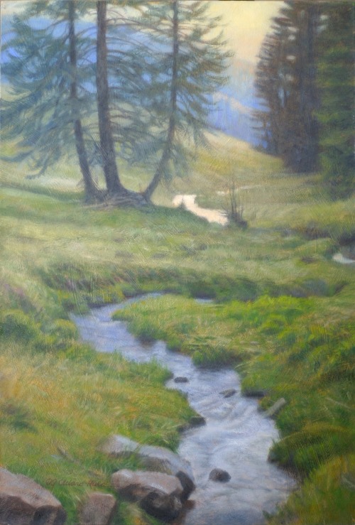
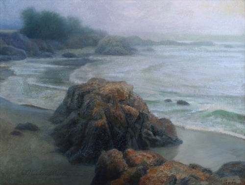
‘Into the Black Forest’ | 12" x 8” oil (sold)

The design of a painting encompasses many facets: composition, weight, scale, movement of the eye, texture… and colour.  Colour is often overlooked or underutilized as a design element.  Many artists feel that the use of colour is simply intuitive (though intuition certainly has value) when in fact it can be one of the most powerful tools in conveying the artist’s intentions. 

Bringing colour under conscious control is a fantastic device for creative communication and expression.  While I’ll design a painting using my own approach to colour theory, it’s also inspirational to see how certain colour combinations appear in nature such as the particular green of stem and leaf complimenting a red rose. 

During a family trip to the Black Forest in Germany, we went for a hike in an alpine meadow and came across this lovely scene of a mountain stream carving its winding way down the slope.  I was taken by the natural harmony of the various greens in the grass enhanced by the analogous blue of the distant hill and reflections in the water as well as the hints of yellow in the setting sky.

For all you colour nerds/enthusiasts, these colours work well with each other because of their close analogous placement on the colour wheel.  In other words, it is the third of the colour wheel between yellow and blue.  Despite the dominant colours being green and blue, I feel I achieved an overall warmth in the painting through the use of yellow.

In the design of this piece, I consciously used colour (and saturation) to help move the eye through and around the various elements of the landscape. For example, the use of the two blues near the top and the bottom of the composition, move the eye back and forth between those areas.  The yellow of the sky reflected in the stream and then played up in the bottom left hand corner creates another path for the eye.  These keep the painting interesting and gives the viewer a sense of movement, despite the scene being idyllic and restful.

From Behind the Easel: Animals with Attitude

From Behind the Easel: Animals with Attitude


‘Rough-Legged Hawk’ | 16”x12” | acrylic on board

When I feel compelled to paint an animal, it is usually because of their innate beauty or unique pose that enhances a composition.  Sometimes I am simply drawn to an animal’s attitude or personality.  This is certainly the case with this rough-legged hawk.  While he is a beautiful specimen in his own right, what I love is the regal way in which he carries himself with human-like poise.  He looks good and I think he knows it!

Anyone with pets or who has spent a lot of time around animals knows they have very distinct personalities.  We also know that animals are  capable of complex emotions and feelings.  Sometimes when I am photographing animals, I will quietly ask certain “models” if they would like to be featured in a painting.  Believe it or not, this usually leads to them holding a specific angle I am hoping to capture.  Coincidence, maybe, but I like to believe animals are operating on a higher level than we imagine! 

Saturday 3 May 2014

The Pensive Palette: The Value of Plein Air Painting

The Pensive Palette: The Value of Plein Air Painting


Sea Ranch | 9”x12” | oil  (available) - painted on site

These days, it’s easy for artists to gather reference with digital cameras or clicking around on Google. Photoshop can assist in perfecting that composition or combining multiple images into a single dynamic reference.  But ultimately, our best tool is our own perception, our senses in the moment in the space where we are.

Our eyes see three dimensions, colour, value, the quality of light and air differently than a camera, and the place we are in makes a deep impression on us well beyond the digital film plane.  The camera can help remind us and jog our recall, but the experience of capturing the moment, the mood, the emotion, and sense of space is invaluable in understanding and then interpreting out into the work. 

An artist’s experiences help generate their unique view of the world and the resulting art that they create.

While a plein air painting is often less refined or more raw than studio work, it has a sense of energy and immediacy.  Whether it's in preparation for a studio piece or just for the fun and satisfaction of capturing the essence of the moment, adding some plein air expeditions to your life brings richness and reward.

Introducing: 'Moon Rise'

Introducing: 'Moon Rise' | Okanagan Valley | 12" x 8" | oil on board


Small study in preparation for a larger studio piece.

Thursday 1 May 2014

From Behind the Easel: Sentinel

From Behind the Easel:
'Sentinel' | Western Gull | 12 x 9 | acrylic on board (available)

The reference for this fence is an old split-rail fence from Pt. Reyes (Northern California) that we saw at sunset one day while hiking.  

The vertical cropping reminded me of a Chinese character, which created a quiet, peaceful mood for me.  But the solidity of the fence also provided strength and grounding, making me think about a soldier walking on a parapet, standing guard.

So this idea emerged, of a gull standing quietly, keeping watch over his domain.