Showing posts with label the pensive palette. Show all posts

Saturday, 19 March 2016

The Pensive Palette: A Touch Of Spring


“Touch of Spring”, 18”x24”, acrylic on board

As we begin to thaw from the winter chill, we look forward to longer days and the return of our feathered friends from holiday. I like to imagine nature is a great theatrical stage and the critters are the players. Birds are my favorite “actors” and always add a spark of life to a wilderness experience.  Here’s a little touch of spring for your viewing pleasure!

Monday, 28 September 2015

The Pensive Palette: Poised


“Poised”, 9”x12” acrylic on board

Sometimes, especially on small paintings, I depict my subject matter in a vignette style. This means that I create a fairly simple background without the environment that clearly allows the focus to be on the animal or bird. This doesn’t mean the background is not important. The colors and textures chosen need to compliment the subject and are hopefully interesting unto themselves. This a technique often employed by portrait artists to showcase the sitter. I like giving our furry and feathered friends this same treatment!

I was fortunate to have permission to use Frank Cleland’s wonderful photo of a Cassin’s Finch for my painting “Poised”. His photo lent itself to the vignette style because it was shot with a telephoto lens that blurred the background. I used specific colors to show off the bird, and subtle brushstrokes to help keep the background from feeling flat and lifeless. I also faded the branch into the background to remind the viewer that, while realistically portrayed, it is a painting and not a photo.

Tuesday, 27 January 2015

The Pensive Palette: Silhouettes


"Marsh Wren", 22"x14", oil on board

Visual clarity and simplicity are often forgotten by artists who are so excited about their subject matter that they include everything.  Good picture making begins with a solid idea expressed through strong composition.  To help me achieve my compositional goals and maintain a clear visual message, I will often use silhouettes to make sure the main elements read well.  Reducing shapes to basic silhouettes allows me to focus on shapes without the distraction of colour or detail.  I can also make sure the shape I'm working on is interesting and drawn well.

When testing with silhouettes I will usually work quite small (thumbnails under 2") so I'm not tempted to get fussy.  I want to make decisions based on readability and detail only makes this harder.  We all love detail and can easily fall in love with superficial aspects of a subject while forgetting the overall shape of what we're painting.  Another helpful tool is a digital camera or smartphone.  You can take a photo of a sketch or painting in the early stage.  Use a very small, black and white version of this photo to study the overall impact of the shapes and make sure what you want to say is being heard.

Tuesday, 25 November 2014

The Pensive Palette: Your Eyes


“Beheld”, 9”x12” acrylic on board     

“All art is at once surface and symbol.” (Oscar Wilde)

Art offers itself as both decorative and meaningful. Sometimes the meaning is minimal or self-evident. At its best, art is layered and mysterious. It can be a powerful tool for us to see inside ourselves and learn about the world. Art is a personal endeavor because our interactions are based on what we bring to the process. Our experiences, knowledge, preferences, and hearts help us hear when art is speaking directly to us. It is the difference between “that’s pretty” and “I gotta have that!”. 

Friday, 11 July 2014

The Pensive Palette: You Light Up My Life


“Water Dance”, 12”x16”, oil on board


Most realist painting includes an element of what we see.  The majority of people think we see stuff.  The reality is we see light reflecting off of stuff.  How we see the stuff depends on the quality, intensity, and color of the light source that allows us to see the object.  As a painter, it is important to remember we are capturing the effects of light on objects.  Developing a keen eye and ability to really see light is paramount.  We need to be able to distinguish subtle changes and shifts in light quality.  The more we understand the world around us, the more we can dissect and reconstruct it in our art.

My painting “Water Dance” is all about the gorgeous, fleeting time of day before sunset known as the magic hour.  The sun’s light is nearing the horizon and traveling at a more severe angle, needing to pass through more air molecules.  Short blue and violet light waves are scattered by the atmosphere and longer orange-red light waves pass through unaffected.  This produces the warm glow we see on objects near sunset.  

The observant artist can study all the light around them and make use of quality, direction, and color of light to convey time of day as well as mood and emotion.

Thursday, 19 June 2014

The Pensive Palette: The Value of Art


The most important component of creating anything visual is value and value relationships.  Value is the how light or dark something appears and is based on a grey scale with black and white at the ends of the scale.  Although we describe them as colors, black, white, and the neutral greys in between are not technically colors, but values of light and dark.  Every color, however, has a value that is used to describe its lightness or darkness.  This is particularly helpful when trying to see the relative differences in values between multiple colors.

When designing a image, it is paramount to think in times of value before color.  Experience allows an artist to see value and color at the same time, but it is still helpful to work in black and white (and grey) in the early stages of design.  Color rarely saves a bad value design and usually only furthers the issue.  In fact, when an artist begins with a strong eye for value , almost any color scheme can be used as long as the colors chosen match the values in the design.

In my painting, “Magnificat”, you can see how I’ve used many colors to enhance the visual interest of the lion, but in black and white the values of those colors are similar enough to not distract from the overall design. 

Thursday, 12 June 2014

The Pensive Palette: I Am Robert Genn


As an artist, I feel a part of a greater community, a brother and sisterhood of creative people searching for beauty, truth, and meaning.  While I work by myself, I know I’m not alone in these pursuits.  When I see art that touches me, or a song that moves me, I feel connected to that artist because we have shared a part of the journey together.  I take a little part of that person’s spirit and place it within me, hoping to pass it along to someone else.  This is the greatest gift of art.

I recently wrote about the passing of artist Robert Genn.  His love of painting, and especially his exploration of the why’s and how’s of making art, live on in everything he touched.  A little piece of his spirit is carried by all of us.   

Here is a small study I did a few years ago in Genn’s style.  It is not a copy of one of his paintings, but an exercise in taking my own reference and trying to think like he did.  In making choices that are different from my own tendencies, I learn how to see outside of myself. 

Thursday, 29 May 2014

The Pensive Palette: The Value of Mirror Image


‘Stillness’ (Study) | 16”x20” | oil on canvas

We all have a natural bias when creating a composition.  Our brains feel more comfortable leaning one way or the other when looking at the visual weight of a design. 
Usually, we aren’t aware that this is happening and will only see it when someone else’s “fresh” eye point it out.  How can we catch it before this happens?  The easiest way is to look at the image in reverse. 
If you are working digitally, simply flip the image over and you will immediately notice if the piece is unbalanced.  If you are working on something physical, look at the image in a mirror.  I like to get at least 10-15 feet away from the painting and use a hand mirror over my shoulder.  If your studio is small, take the work outside.  You can also take a digital photo and reverse it horizontally. 
In time you can start to notice your tendencies and address them while working, but old habits die amazingly hard!

Thursday, 15 May 2014

The Pensive Palette: Opposites Attract

The Pensive Palette: Opposites Attract


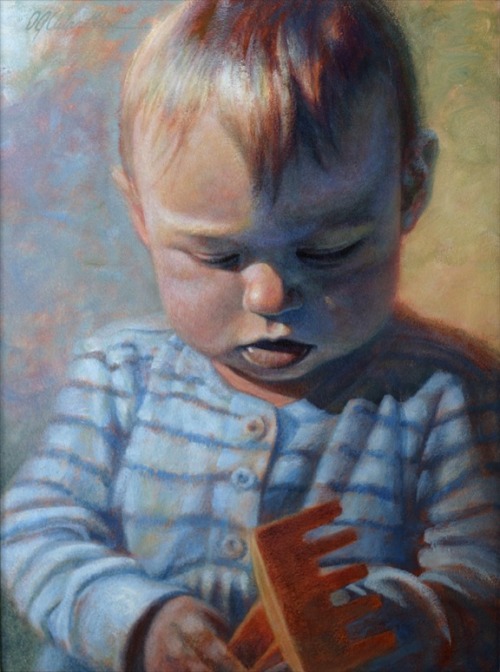
'Annika At One' | Aug 26, 2001 | 16”x12” Acrylic on board

When I decided to paint our eldest daughter on her first birthday, I chose to work in a fairly simple and classic portrait format.  I wanted the emphasis to be on her without a lot of distractions…
In order to keep the painting interesting and alive, I made color choices from a design point of view.  In this case, I employed complimentary or “opposite” colors.  These are the colors that are across from each other on the color wheel and are often used to enhance contrast. 

The main complementary pair I used was blue and orange, but there is also the yellow/purple pairing.  In order to make all of these colors work together, I chose blue to be my dominant color so the four colors wouldn’t compete.  I also made sure to desaturate most of the colors to keep them all fairly quiet.  Orange, the complement of my dominant blue, is the most saturated color.  This was done to help emphasize her hair and the shovel and create visual points of interest for the eye to go between.

I made the shadow side of her face a very subtle purple to give our eyes a break from the dominant blue.  In order to give this purple shadow a bit of color harmony, the background on the right side of the painting tends toward yellow.  Because I kept these colors quite desaturated, they do not look garish.  In fact, if you look closely you will see all of the colors of the rainbow in the painting, but desaturation keeps the color palette—and the final painting— in balance.