Showing posts with label colour. Show all posts

Monday, 2 March 2015

Inspiring Image: One Of My Dots


"Among The Teasels", Randal Dutra, 36" x 50", Oil on linen

I recently posted a quote by Steve Jobs where he advocated for connecting the dots of your life to help find your unique views.  Sometimes your dots can include the many dots of another person who is influential in your life.  I am fortunate to call artist Randal Dutra both mentor and friend.  Randal embodies the creative spirit and is fluent with any medium he feels will convey his vision.  Aside from his beautiful paintings and bronzes, Randal has amassed a 25 year career in film where he worked primarily in animation.  He is best known for his pioneering work on Jurassic Park and was nominated for an Academy Award for directing the animation on Steven Spielberg's War Of The Worlds.

Over the years, Randal has been generous with words of advice, critique, and inspiration.  I am the lucky recipient of his many years of experience across multiple genre and medium.  As we find our way along our journey, it important to remember that others walk before us and can be incredible resources.  When possible, look to those ahead of you for direction, inspiration, and how one can connect the dots.

See more of Randal's work at www.randaldutra.com

Tuesday, 11 November 2014

From Behind the Easel: Descending Shadows


“Descending Shadows”, 24”x18”” oil on board

As some of you may know, our family has recently decided to make some shifts in our perspective and attempt to follow our own path.  What that means is we sold our house, took the kids out of school, and started accepting what the world was offering us.  Our plan is loosely structured and we make our decisions together.  The kids are all homeschooling (or as I like to say “lifeschooling”) and we are finding truly wonderful learning experiences outside of the traditional model.  This is something we have contemplated for many years and have finally had the courage to attempt.  We feel blessed to be in a position to take hold of this opportunity.

Our most recent excursion was moving ourselves eastward for nearly three weeks to house/kitty-sit for dear friends who were away in Europe.  We had the fabulous chance to experience living in the Okanagan valley, affectionately known as Napa North for the many world-class wineries.  The valley is the northern tip of the Sonora Desert and is a richly bio-diverse environment.  We were treated to amazing views of clouds rolling into the valley below while mule deer and bighorn sheep grazed the property.  Needless to say the inspiration for painting was prevalent and I look forward to what will come from our stay there.

Here is a painting I did based on previous trips to the area.  You can see the beautiful rock outcrop as a backdrop to the understated beauty of the sagebrush, all backlit by the beautiful Okanagan light.  You can see another painting I did from the area in my post from May 17, 2014.

Saturday, 18 October 2014

From Behind the Easel: Colour Me Glad


“Autumn’s Embrace”, 24”x18”” acrylic on canvas

Autumn is here and my heart leaps.  The shortened days and crisper temperatures remind us that the year is quickly sliding into the darker half.  We collect our bounty as we brace against the barren time ahead.  Our thoughts turn inward while personal journeys of recollection take hold.  But before we shutter ourselves away for the winter, we are treated to nature’s triumph of color.  The artist in autumn is offered the most freedom to explore a vivid palette while remaining true to the source.


My painting “Autumn’s Embrace” features a pair of cedar waxwings against the turning leaves of an aspen.  I love to walk among stands of aspen as they filter the light and gently quake in the breeze.  Their turning leaves have almost a pointillist quality and I decided to frame the tree in my painting quite closely so it has a slightly abstract feel to it.

Thursday, 19 June 2014

The Pensive Palette: The Value of Art


The most important component of creating anything visual is value and value relationships.  Value is the how light or dark something appears and is based on a grey scale with black and white at the ends of the scale.  Although we describe them as colors, black, white, and the neutral greys in between are not technically colors, but values of light and dark.  Every color, however, has a value that is used to describe its lightness or darkness.  This is particularly helpful when trying to see the relative differences in values between multiple colors.

When designing a image, it is paramount to think in times of value before color.  Experience allows an artist to see value and color at the same time, but it is still helpful to work in black and white (and grey) in the early stages of design.  Color rarely saves a bad value design and usually only furthers the issue.  In fact, when an artist begins with a strong eye for value , almost any color scheme can be used as long as the colors chosen match the values in the design.

In my painting, “Magnificat”, you can see how I’ve used many colors to enhance the visual interest of the lion, but in black and white the values of those colors are similar enough to not distract from the overall design. 

Thursday, 15 May 2014

The Pensive Palette: Opposites Attract

The Pensive Palette: Opposites Attract


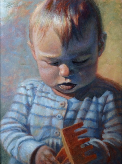
'Annika At One' | Aug 26, 2001 | 16”x12” Acrylic on board

When I decided to paint our eldest daughter on her first birthday, I chose to work in a fairly simple and classic portrait format.  I wanted the emphasis to be on her without a lot of distractions…
In order to keep the painting interesting and alive, I made color choices from a design point of view.  In this case, I employed complimentary or “opposite” colors.  These are the colors that are across from each other on the color wheel and are often used to enhance contrast. 

The main complementary pair I used was blue and orange, but there is also the yellow/purple pairing.  In order to make all of these colors work together, I chose blue to be my dominant color so the four colors wouldn’t compete.  I also made sure to desaturate most of the colors to keep them all fairly quiet.  Orange, the complement of my dominant blue, is the most saturated color.  This was done to help emphasize her hair and the shovel and create visual points of interest for the eye to go between.

I made the shadow side of her face a very subtle purple to give our eyes a break from the dominant blue.  In order to give this purple shadow a bit of color harmony, the background on the right side of the painting tends toward yellow.  Because I kept these colors quite desaturated, they do not look garish.  In fact, if you look closely you will see all of the colors of the rainbow in the painting, but desaturation keeps the color palette—and the final painting— in balance.

Sunday, 4 May 2014

From Behind the Easel: On Colour and Design

From Behind the Easel: On Colour and Design


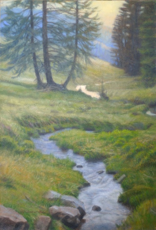
‘Into the Black Forest’ | 12" x 8” oil (sold)

The design of a painting encompasses many facets: composition, weight, scale, movement of the eye, texture… and colour.  Colour is often overlooked or underutilized as a design element.  Many artists feel that the use of colour is simply intuitive (though intuition certainly has value) when in fact it can be one of the most powerful tools in conveying the artist’s intentions. 

Bringing colour under conscious control is a fantastic device for creative communication and expression.  While I’ll design a painting using my own approach to colour theory, it’s also inspirational to see how certain colour combinations appear in nature such as the particular green of stem and leaf complimenting a red rose. 

During a family trip to the Black Forest in Germany, we went for a hike in an alpine meadow and came across this lovely scene of a mountain stream carving its winding way down the slope.  I was taken by the natural harmony of the various greens in the grass enhanced by the analogous blue of the distant hill and reflections in the water as well as the hints of yellow in the setting sky.

For all you colour nerds/enthusiasts, these colours work well with each other because of their close analogous placement on the colour wheel.  In other words, it is the third of the colour wheel between yellow and blue.  Despite the dominant colours being green and blue, I feel I achieved an overall warmth in the painting through the use of yellow.

In the design of this piece, I consciously used colour (and saturation) to help move the eye through and around the various elements of the landscape. For example, the use of the two blues near the top and the bottom of the composition, move the eye back and forth between those areas.  The yellow of the sky reflected in the stream and then played up in the bottom left hand corner creates another path for the eye.  These keep the painting interesting and gives the viewer a sense of movement, despite the scene being idyllic and restful.