Showing posts with label composition. Show all posts

Sunday, 17 April 2016

Inspiring Image: Abstract Reality


“Japanese Lady With Fan”, George Henry (1858-1943)

Here’s a lovely painting that I’ve admired for years. What I most respond to in this piece is the wonderful marriage of abstract and realism. George Henry, a Scottish painter, masterfully designed a beautiful, rich canvas with varied colors and edges. For a relatively small painting, there is much to keep the viewer’s eye engaged, and the entire painting has a lovely decorative quality about it.

Quite magically, we begin to realize the head of a geisha has been placed right in the center of the image. Her head is turned away in a demure fashion that enhances the mystery and intrigue of her character. It is also a clever device to help the artist keep readily identifiable features of her face from taking away from the overall abstract quality.

Monday, 2 March 2015

Inspiring Image: One Of My Dots


"Among The Teasels", Randal Dutra, 36" x 50", Oil on linen

I recently posted a quote by Steve Jobs where he advocated for connecting the dots of your life to help find your unique views.  Sometimes your dots can include the many dots of another person who is influential in your life.  I am fortunate to call artist Randal Dutra both mentor and friend.  Randal embodies the creative spirit and is fluent with any medium he feels will convey his vision.  Aside from his beautiful paintings and bronzes, Randal has amassed a 25 year career in film where he worked primarily in animation.  He is best known for his pioneering work on Jurassic Park and was nominated for an Academy Award for directing the animation on Steven Spielberg's War Of The Worlds.

Over the years, Randal has been generous with words of advice, critique, and inspiration.  I am the lucky recipient of his many years of experience across multiple genre and medium.  As we find our way along our journey, it important to remember that others walk before us and can be incredible resources.  When possible, look to those ahead of you for direction, inspiration, and how one can connect the dots.

See more of Randal's work at www.randaldutra.com

Tuesday, 27 January 2015

The Pensive Palette: Silhouettes


"Marsh Wren", 22"x14", oil on board

Visual clarity and simplicity are often forgotten by artists who are so excited about their subject matter that they include everything.  Good picture making begins with a solid idea expressed through strong composition.  To help me achieve my compositional goals and maintain a clear visual message, I will often use silhouettes to make sure the main elements read well.  Reducing shapes to basic silhouettes allows me to focus on shapes without the distraction of colour or detail.  I can also make sure the shape I'm working on is interesting and drawn well.

When testing with silhouettes I will usually work quite small (thumbnails under 2") so I'm not tempted to get fussy.  I want to make decisions based on readability and detail only makes this harder.  We all love detail and can easily fall in love with superficial aspects of a subject while forgetting the overall shape of what we're painting.  Another helpful tool is a digital camera or smartphone.  You can take a photo of a sketch or painting in the early stage.  Use a very small, black and white version of this photo to study the overall impact of the shapes and make sure what you want to say is being heard.

Friday, 11 July 2014

The Pensive Palette: You Light Up My Life


“Water Dance”, 12”x16”, oil on board


Most realist painting includes an element of what we see.  The majority of people think we see stuff.  The reality is we see light reflecting off of stuff.  How we see the stuff depends on the quality, intensity, and color of the light source that allows us to see the object.  As a painter, it is important to remember we are capturing the effects of light on objects.  Developing a keen eye and ability to really see light is paramount.  We need to be able to distinguish subtle changes and shifts in light quality.  The more we understand the world around us, the more we can dissect and reconstruct it in our art.

My painting “Water Dance” is all about the gorgeous, fleeting time of day before sunset known as the magic hour.  The sun’s light is nearing the horizon and traveling at a more severe angle, needing to pass through more air molecules.  Short blue and violet light waves are scattered by the atmosphere and longer orange-red light waves pass through unaffected.  This produces the warm glow we see on objects near sunset.  

The observant artist can study all the light around them and make use of quality, direction, and color of light to convey time of day as well as mood and emotion.

Thursday, 19 June 2014

The Pensive Palette: The Value of Art


The most important component of creating anything visual is value and value relationships.  Value is the how light or dark something appears and is based on a grey scale with black and white at the ends of the scale.  Although we describe them as colors, black, white, and the neutral greys in between are not technically colors, but values of light and dark.  Every color, however, has a value that is used to describe its lightness or darkness.  This is particularly helpful when trying to see the relative differences in values between multiple colors.

When designing a image, it is paramount to think in times of value before color.  Experience allows an artist to see value and color at the same time, but it is still helpful to work in black and white (and grey) in the early stages of design.  Color rarely saves a bad value design and usually only furthers the issue.  In fact, when an artist begins with a strong eye for value , almost any color scheme can be used as long as the colors chosen match the values in the design.

In my painting, “Magnificat”, you can see how I’ve used many colors to enhance the visual interest of the lion, but in black and white the values of those colors are similar enough to not distract from the overall design. 

Thursday, 29 May 2014

The Pensive Palette: The Value of Mirror Image


‘Stillness’ (Study) | 16”x20” | oil on canvas

We all have a natural bias when creating a composition.  Our brains feel more comfortable leaning one way or the other when looking at the visual weight of a design. 
Usually, we aren’t aware that this is happening and will only see it when someone else’s “fresh” eye point it out.  How can we catch it before this happens?  The easiest way is to look at the image in reverse. 
If you are working digitally, simply flip the image over and you will immediately notice if the piece is unbalanced.  If you are working on something physical, look at the image in a mirror.  I like to get at least 10-15 feet away from the painting and use a hand mirror over my shoulder.  If your studio is small, take the work outside.  You can also take a digital photo and reverse it horizontally. 
In time you can start to notice your tendencies and address them while working, but old habits die amazingly hard!

Wednesday, 21 May 2014

Inspiring Image: Wyeth He So Great


Piece by N.C. Wyeth (father of Andrew Wyeth) - 1907

N.C. Wyeth was one of the great illustrators of America’s golden age at the beginning of the 20th century.  A student of Howard Pyle, Wyeth was well known for his amazing visual ability to capture a complete scene.  Often, his paintings accompanied great works of lit

erature like Treasure Island, Robin Hood, and Robinson Crusoe.  He was famous for dressing his friends and family in period costume to model for him.

What I love about his work is the strong efficiency of line and composition.  His paintings are uncluttered and clear while maintaining our interest.  In this painting of a Native American from 1907, Wyeth creates a beautiful mood of solitude and reflection.  His vertical format shows the influence of Japanese prints and, although heavily weighted on the left, maintains balance with the paddler’s gaze to the right.  Wyeth’s ability to conjure these images from his imagination are an inspiration to anyone who has ever sat before a blank canvas.

Monday, 5 May 2014

The Pensive Palette: On Negative Space

The Pensive Palette: On Negative Space


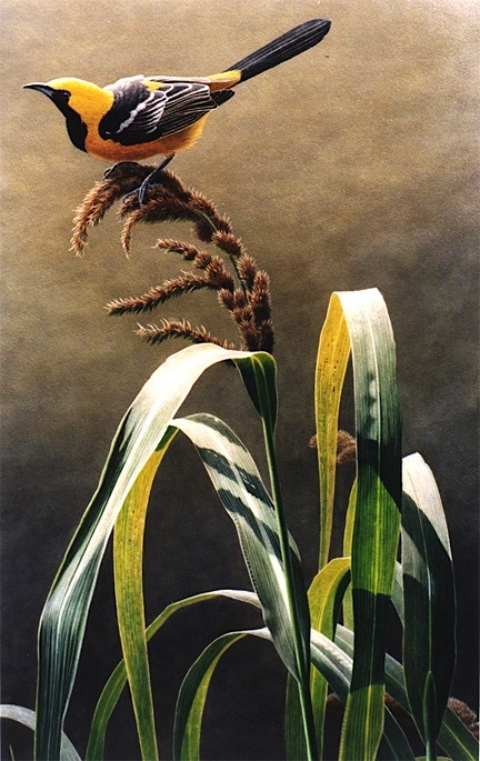
‘Alight’ | 24” x 14” | acrylic on board (sold)

“The design of negative space can be just as important as the positive image.” (Joan Fedoroshyn)

As an artist, it is easy to be seduced by the primary subject matter we choose to represent.  But when you think of a painting as a flat space to be filled with interesting shapes, then design places just as much importance on the elements that aren’t immediately obvious. 

In music, pauses in a song add interest and build tension-- in the same way, spaces between objects in a painting become necessary and integral elements that require just as much thought as the objects themselves.

In this painting, ‘Alight’, featuring an oriole perched on marsh grass, I was conscious of the repeating arches of the grass bending under the bird’s weight.  The spaces between the blades created an interesting rhythm of pleasing shapes that allow the eye to dance with the positive and negative despite the relative simplicity of the background. I made an effort, in this case, to vary the shapes and keep them both feeling natural and asymmetrical while still giving a sense of balance and movement to the composition.